

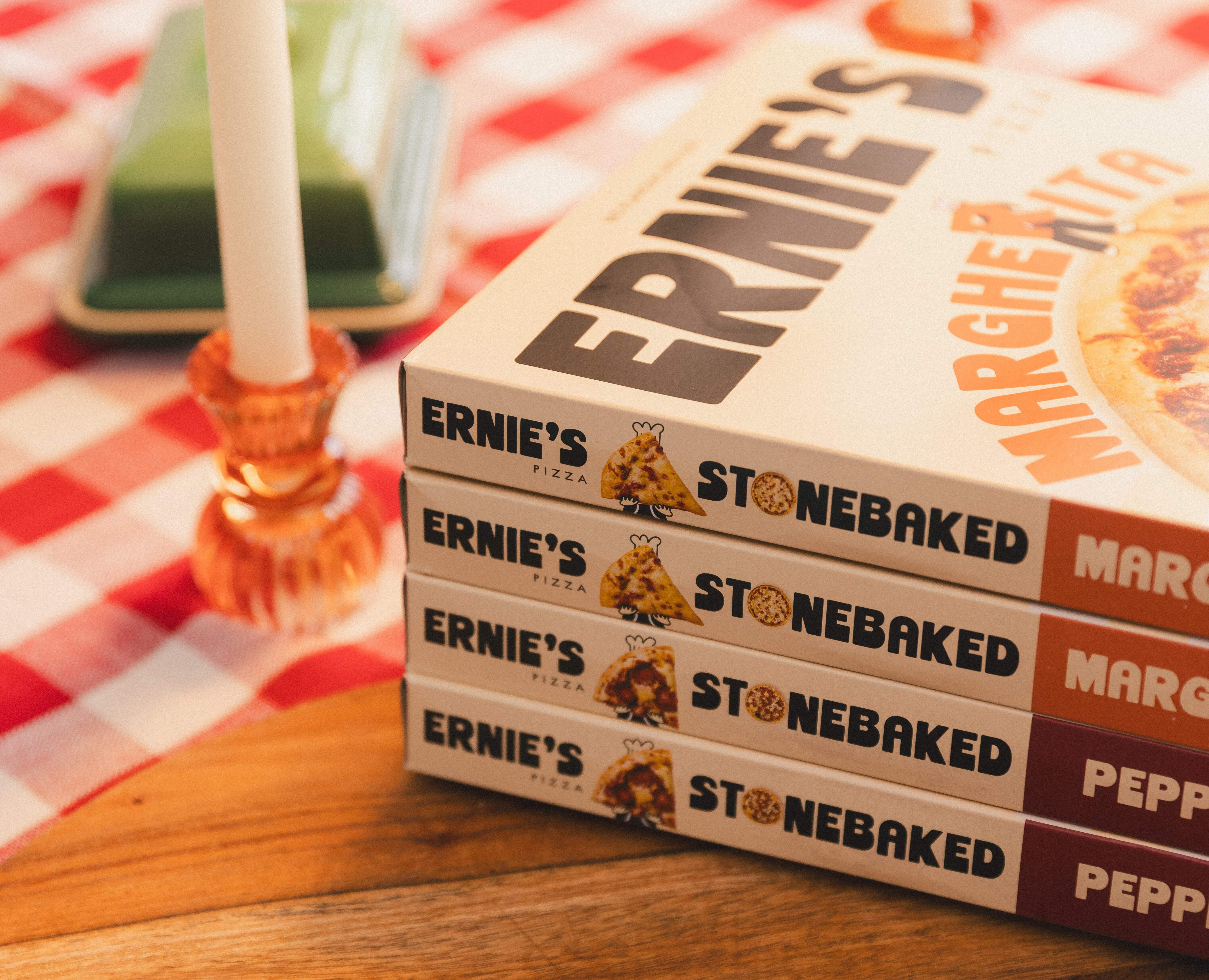
Frozen pizza producer, Freiberger Group, tasked Hatch with building a distinctive brand positioning for a brand-new own brand frozen pizza range, Ernie’s Pizza.
Our challenge was to develop a clear identity for the new pizza brand, available exclusively for ASDA, ensuring that the branding resonated with consumers and supported the brand’s long-term growth. We needed to translate Ernie’s Pizzas’ strategic positioning into a clear, ownable and commercially relevant visual identity.
/ DESIGN
/ SOCIAL MEDIA
/ CONTENT
Hatch developed a distinctive brand positioning rooted in the moment around the food, rather than simply communicating the product itself.
This informed the creation of a playful, character-led visual identity that could build recognition and emotional connection. From logo construction and bold typography through to colour, graphic language and wider brand application, every element was considered as part of a cohesive brand direction. The result was an identity with a very clear point of view. Ernie’s having a strong personality that could evolve beyond the pack and become a recognisable brand asset, in its own right.
At the heart of the identity is Ernie himself.
Hatch developed a suite of character assets, including poses, and supporting sticker illustrations, designed to give the brand a flexible visual toolkit. Each asset was rooted in Ernie’s personality and the wider brand story, allowing him to act as both a recognisable brand ambassador and a versatile graphic device. All while concealing his identity, making the possibilities endless to the imagination. Allowing the consumer to put their own face and personal moments to the brand.
To ensure the identity could be applied consistently as the brand grew, Hatch developed a comprehensive set of brand guidelines covering the core visual system.
This included logo construction and usage, typography, colour palette, imagery, graphic elements and character application. The guidelines established clear principles for execution while allowing enough flexibility for the brand to retain its personality across different formats, channels and production requirements.
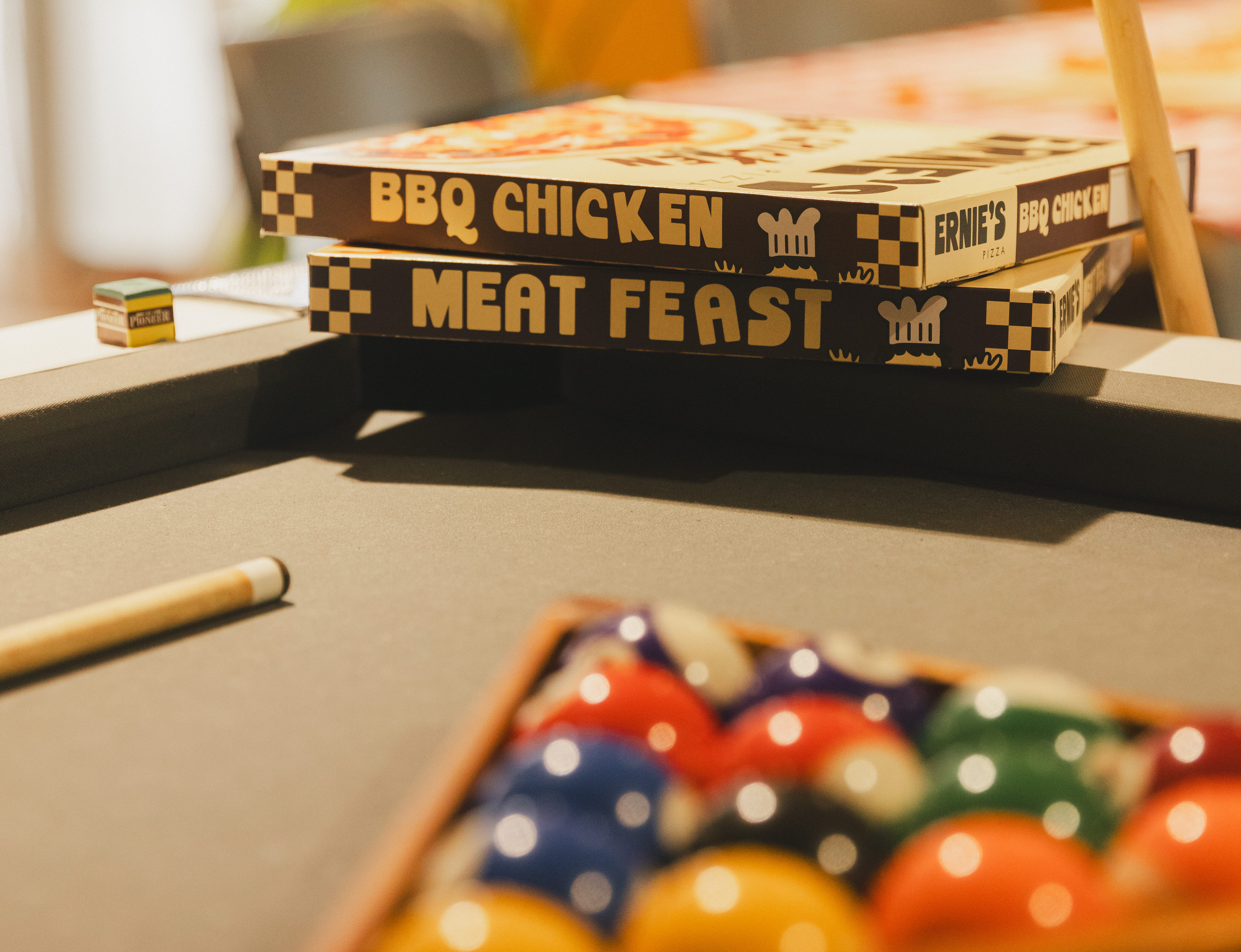
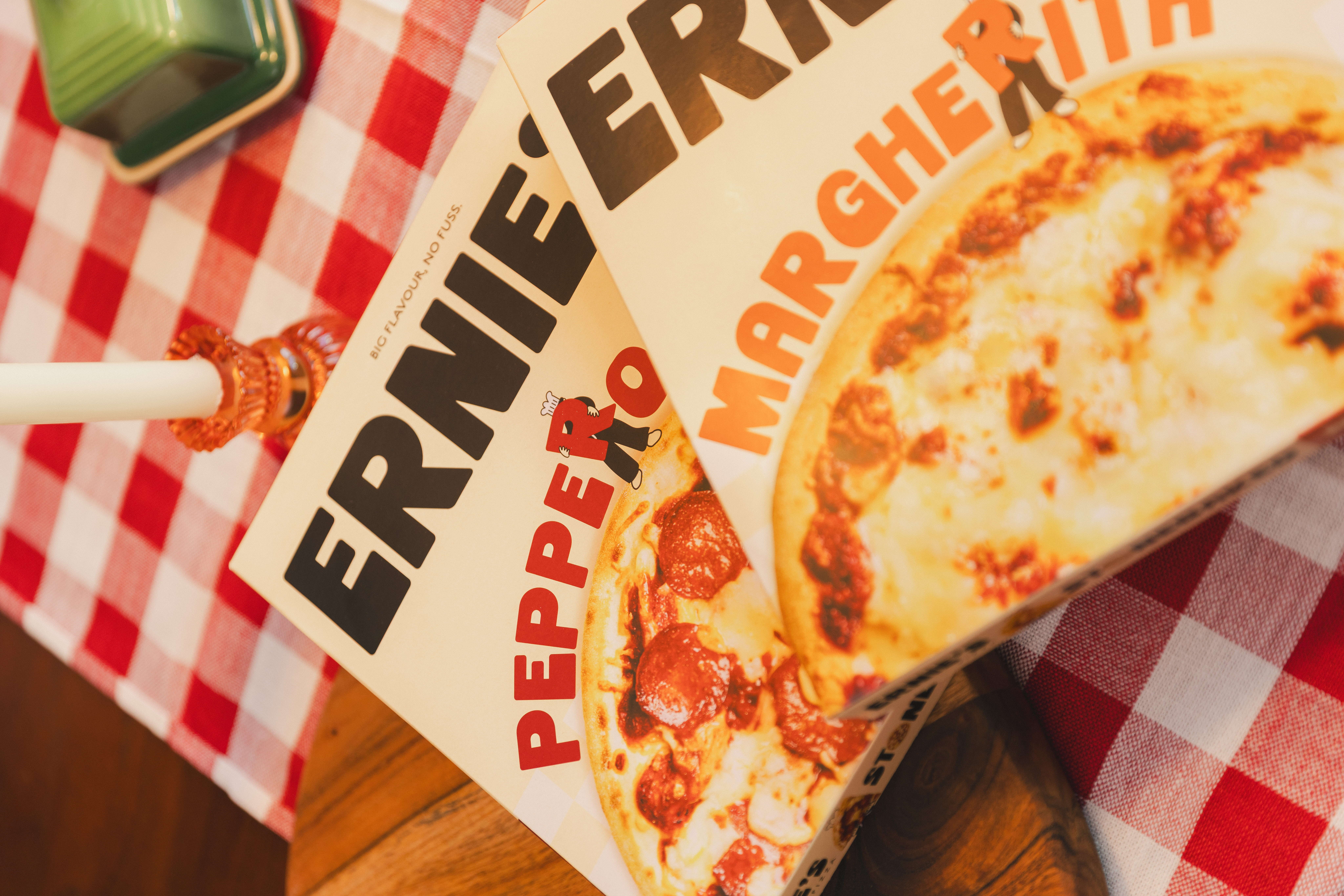
The packaging became one of the key expressions of the Ernie’s brand, translating the identity into a cohesive, scalable range architecture designed to perform at shelf. Hatch developed the packaging system with both brand impact and practical application in mind. Establishing a clear hierarchy using colour to create distinction across the range.
The result is a packaging system that feels consistent and recognisable as a family, while giving individual products enough visual differentiation to navigate the flavours easily. Ultimately, every touchpoint was designed to make Ernie feel less like a product and more like a brand people could recognise, remember and connect with.
Ernie’s was designed to live beyond the shelf, with social providing an opportunity to further build on the visuals. Hatch developed a flexible suite of social assets and content principles that translated the brand’s visual language into a more dynamic, engaging format.
Hatch uses Ernie, bold typography, colour, illustration and playful messaging to create consistency across the feed. This also included incorporating inhouse brand photography direction to give candid, approachable and warm energy. Using real people, real stories and proper good food that consumers can relate to.
The approach was designed to balance brand recognition with content variety, giving the team a clear visual framework while leaving room for reactive, promotional and campaign-led content. This ensured every post felt unmistakably Ernie’s, while continuing to build the character and brand world over time to have more community engagement.
LISTINGS IN ASDA STORES ACROSS THE UK
BESTSELLER IN ASDA'S OWN BRAND PRODUCTS
SOCIAL IMPRESSIONS
Related Case Studies
 Dutch Barn Vodka Brandbook


