Dutch Barn Vodka approached us with a selection of brand assets they had been using it was clear to both parties that the brand at this point had little to no cohesion, because of this we were tasked to build their brand guidelines. In creating the guidelines we were to become brand guardians creating the foundations to what a DBV creative should look like.
The Dutch Barn Vodka creative was in it’s infancy when we were first approached the designs they had been using would show conflicting Layout, colour usages and overlay effects. It was for us to whip the visuals inline by creating a guide that would outline the creative process from start to finish and show examples across print and digital.
/ CONTENT
/ FOOD & BEVERAGE
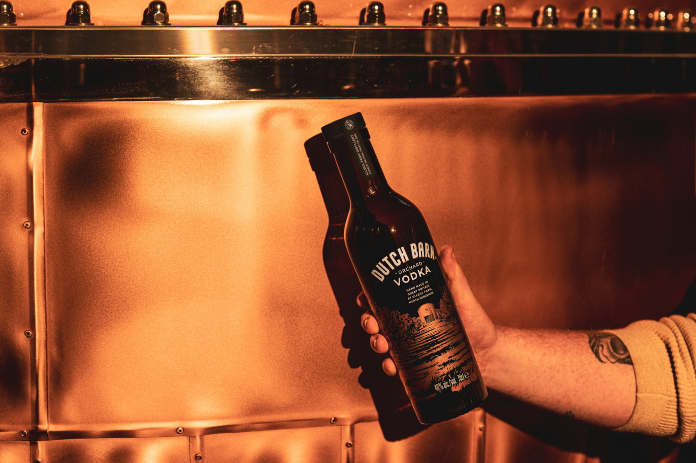
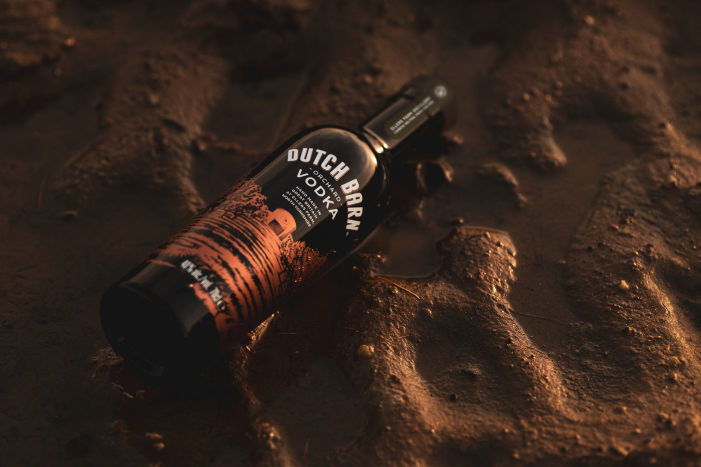
As a starting point we took note of all positive attributes across the brand the key here was refinement, the brand had lost its way through the addition of assets which were not needed, these attributes where needing to be removed. Through this process we stripped the DBV brand to it’s core values and trimmed the excess in doing so the overall styling started to harmonise with a clear rules for typography, colour usage, image selection and overlay effects.
In this process we selected two fonts at three weight variants to ensure there was enough chose to utilise in layout whilst keeping continuity similar to this we outlined what overlays should be used these consisted of paper textures, a suede leather and an illustration of the DBV distillery although limited it to the six core textures each one added new elements to the overall look and feel ensuring versatility across the DBV brand.
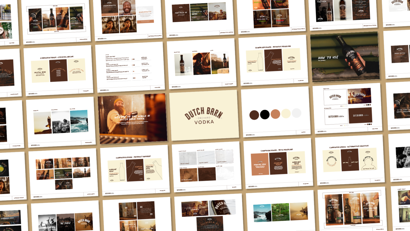
The creative guidelines made holds varying examples that can be used across social, advertorials and video. All that we can now see come to live as the Dutch Barn Vodka brand continues to bloom.
From the early stages of this project timings were key as the product had a launch date we had to ensure that they was time to allow for the rules we had made were implemented.
Instagram feed of over 70+ posts
on Asda’s social channels
Related Case Studies